One of the most important parts of web marketing is not only driving traffic to your website but retaining them long enough to reach your e-commerce page or call-to-action. If they’re not staying and scrolling all the way through your site, what’s making them click away? Here’s a short list of possible reasons, and how you can avoid them.
#1: It’s Too Slow
When people are searching the internet, it’s usually because they need something specific, and they need it now. If your site takes too long to load, your visitors won’t be motivated to stick around – especially in the information age, which has exacerbated impatience. Make sure you don’t have too many complicated videos or motion graphics such as sliders, or an overcomplicated page layout that’s slowing your site down.

#2: It’s Too Confusing
By the same principle, if it’s taking too long for visitors to find what they’re looking for, they’ll also grow impatient and look elsewhere. This is another repercussion of having an overly complicated page layout, burying your most essential content deep in the site, making your product or CTA difficult to detect or inaccessible, etc.
Whatever the main purpose of your site is, put it up front and center, and make sure your patrons know how to access it (for example, use a brightly colored hyperlink).
#3: It’s Too Boring

On the other side of the coin, if your page is too simplistic and lacks any flare at all, it will be displeasing to the eye and won’t attract usership. Keep style in mind, but never put style over substance. User experience should be your first priority, and your stylistic choices should be informed by this. Choose a minimal, clear, and elegant style, with a consonant and bright color palette. Beauty and ease of use should go hand-in-hand.
#4: It’s Not Mobile-Ready
This one cannot be stressed enough. In 2022, most people are using the internet on their phones. If you have a site design which does not have a mobile version, so visitors open it to find a miniature desktop site with microscopic text and images, they will immediately leave. In order to stay relevant, you’ve got to adapt to the current technologies people are using to visit your site.
#5: It’s Not Legible
By that same token, even if you do have a mobile-ready version of your site but your mobile or desktop site are difficult to read, this too will frustrate your visitors and cause them to leave. Use a clear, simple and pleasing font, at an easy-to-read size, and make sure the color contrast between the text and the background is conducive to legibility.

#6: It’s Got Too Many Pop-Ups
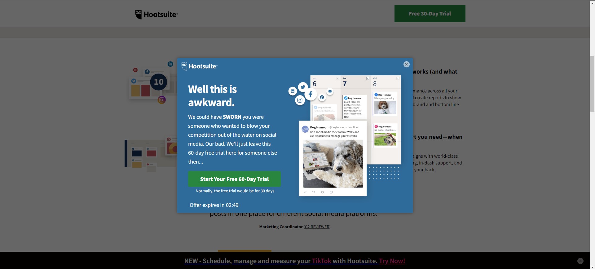
There’s nothing worse than a spammy website. Patrons want to visit your site for the service you provide, not to be accosted by advertisements for things they don’t want. If you use this method to generate ad revenue, consider a less intrusive and abrasive way of going about it, such as in-page ads or a Patreon if appropriate.
#7: You Have Clips that Autoplay
By now hopefully you’ve caught on to the motif that any extraneous or distracting information on your site is detrimental to your visitor retention. Anything your visitors are confronted with that they didn’t ask for, is not appreciated. Embellishments that you think are adding style and flare to your site are really discouraging patronage. Included in this list is any video or audio content that autoplays upon opening the page. If your viewer wasn’t expecting that, they’ll be jarred by it, and their first instinct will be to make it stop right away. The easiest way to do that is to leave.
#8: Obstructive Registration Requirement

If your website requires a registration, make sure it is properly placed in the site. Never put it up front or at the beginning of the site, and never in the middle of a task that your visitor is attempting to complete such as a form or online order. Again, user experience should be the guiding credo of your site design.
#9: Your Content Isn’t Up to Par
Last, but certainly not least, don’t forget that it’s not all about presentation. At the end of the day, it’s about the content that you’re delivering to your users. Whether this content is itself low quality (unoriginal, not up to date, incomplete, etc.) or it has grammatical or spelling errors or is poorly organized, this is of paramount importance to your user retention.
At the end of the day, all of this boils down to whether you are making good on the promise of your site. Are site visitors getting out of their experience what they need to? This should be the number one question your site development and management are answering. When you are building a site, try to view it first and foremost from the perspective of a visitor, rather than an owner. Then you won’t go wrong.


