Web design is, as we’ve stated before, one of the most vital art forms of the digital age. It’s the most basic determinant of how people experience the web. Which is where the bulk of communications, exchanges, entertainment, and more are taking place in the 21st century. Designers build and guide this experience, through a combination of aesthetic and practical sensibilities. 6 Poor Websites and Why They’re Bad
But not all web design is created equal. It’s easy to get wrong, and many prominent websites can make surprising errors in their design elements. Whether by favoring some aspects while ignoring others, getting too advanced and forgetting the basics, etc.
We don’t want to be mean – just helpful. So, we’re offering some of our perspectives on what web platforms exemplify poor web design, and what they could do to be better.
#1: ZARA
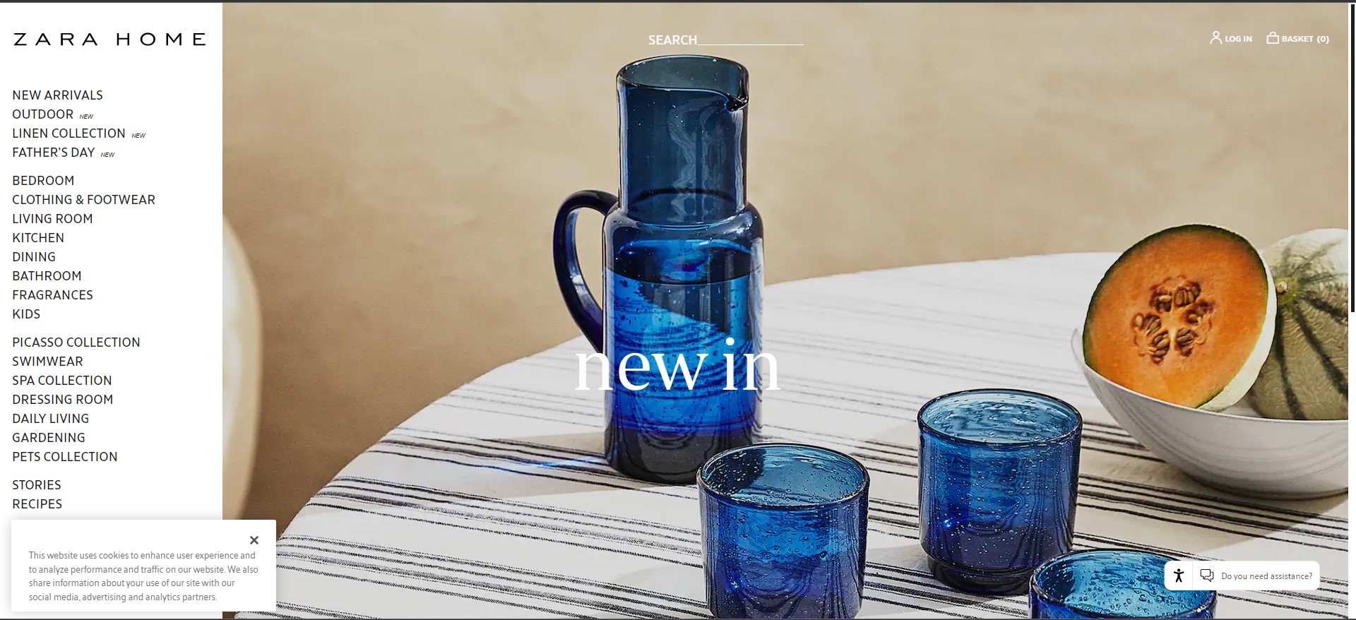
The homepage of Spanish fashion powerhouse ZARA is sleek, hip, and elegant much like its brand – but it’s not very navigable.
Take for example the landing page of its US domain. It’s filled with side-swiping headlines and accompanying agile images reading “I’m Awake!” and “Weekend at Edie’s,” which might inspire curiosity but don’t exactly scream what they are supposed to represent.
Meanwhile the navigation for the web pages within is hidden and appears when you point your mouse to the extreme left. Which you do, not because there’s any indication that you’re supposed to, but probably by pure accident. The layout for the product lookup is also unorganized, with randomly appearing images of unequal size.
If ZARA doesn’t want its users to click away to a less confusing site, we suggest they dispense with the cryptic messaging and display their website options in a prominent, easy-to-find manner. You can do all this while retaining the fresh, beautiful look that the site does well.
#2: Wayfair
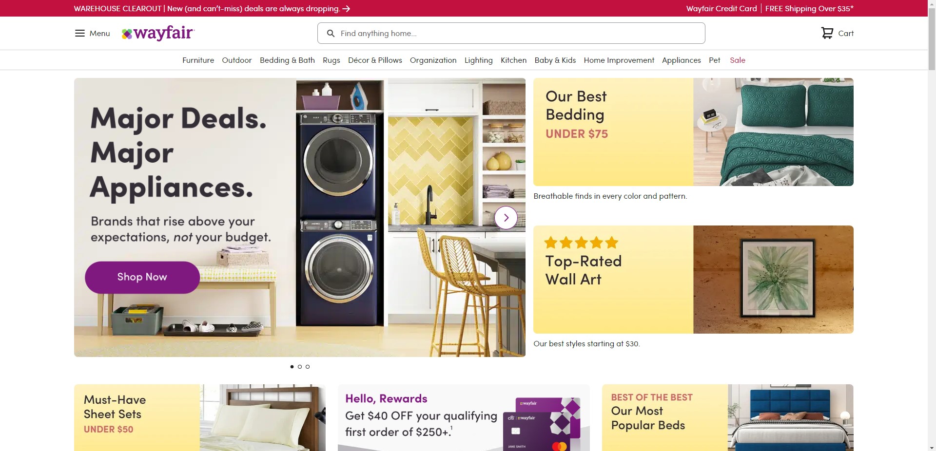
Furniture and home goods e-store Wayfair makes a similar error in kind of the inverse way – it’s confusing in that it puts too much out there, in no clear order.
The front page is a cavalcade of blocks, bombarding the viewer with options – “Appliances that keep up!” “Area rugs!” “Our most popular beds!” – but gives no clear path for the user experience to follow.
Also, this overabundance of elements is compounded with moving images, too many colors and themes, and text of various sizes, some of it a little difficult to read.
To avoid these problems, simplify your theme, and employ visual hierarchy into your design structure.
Create a clear vertical path on your homepage. Display the options in a less overwhelming way. Make each design element large and clear. Call your user’s eye to the elements you want it to perceive first, and second, and third, up to the last.
Let your user’s journey be a narrative that takes them from the opening to the space they want to go to, to your call to action (in this case, a prompt to purchase the items you offer).
#3: eBay
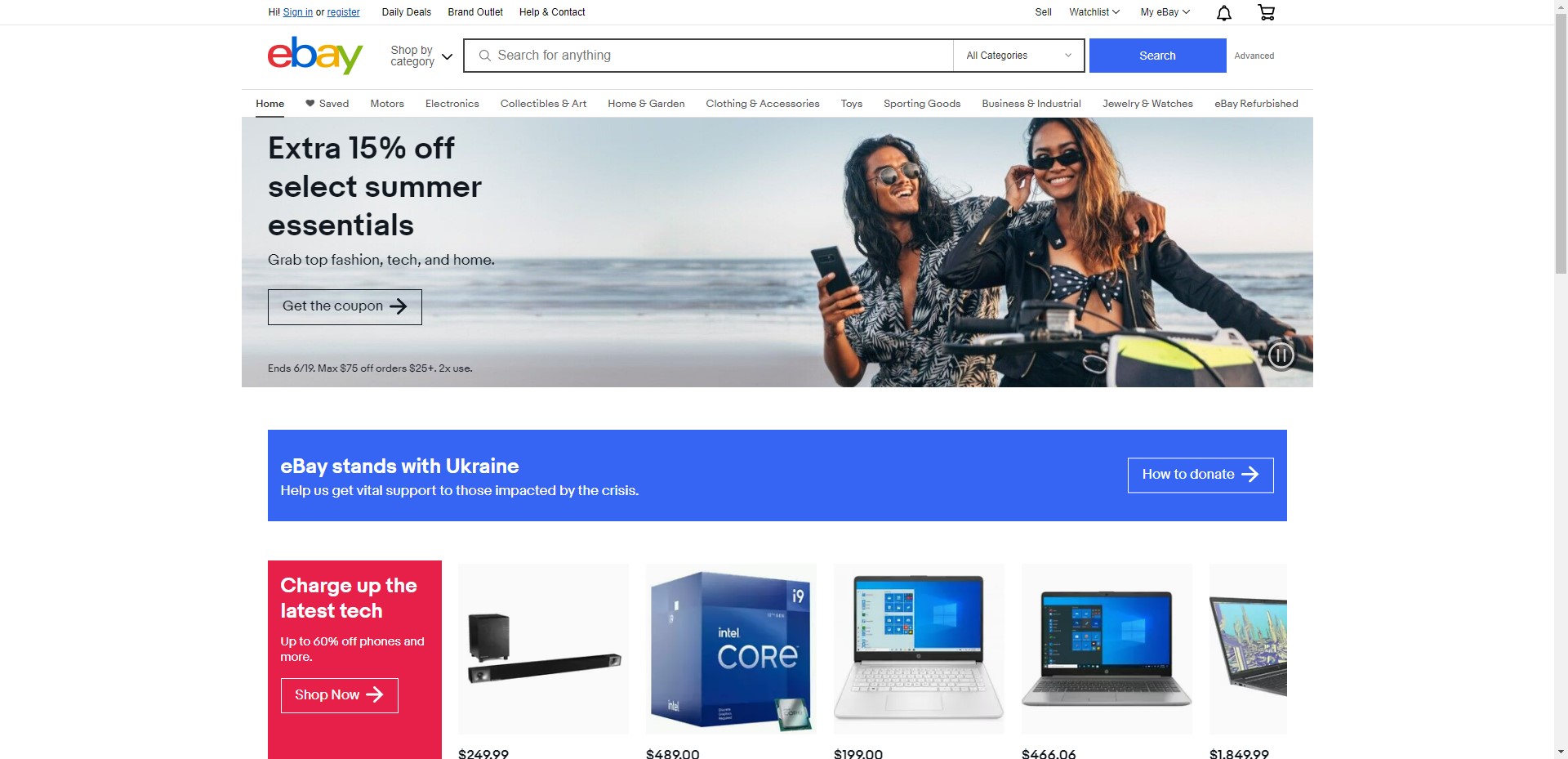
For one of the best-known and most popular websites on the internet, eBay’s product pages sure are cluttered.
All the images are crowded on the left-hand side, the product name, description, price etc. crowded in the center, and further options crowded on the right. 6 Poor Websites and Why They’re Bad
Once again, this is a problem of a lack of visual hierarchy – the visitor is not being guided through their user experience, just getting everything thrown at them all at once and made to fend for themselves.
A better way to organize it would be for each product page to be headed with the product name, with jump links or tabs leading to each area of information the customer needs. Including product details, pricing, shipping, etc. Be mindful of your user’s path.
#4: Madewell
As we have stated repeatedly, mobile is the wave of the future . The vast majority of internet users are accessing the web via a mobile device in 2022. So if you’re not designing your website to be conducive to a mobile format, frankly, you’re doing it wrong.
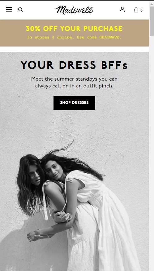
Case in point: Madewell. This apparel outlet does well enough communicating its design elements on its desktop version, but on mobile, it falls a bit short.
A good example of this is changing your password, for which the mobile site requires that you click the text that reads “HI, [NAME],” opening user details, then leading you to the change password option. There’s nothing that clearly indicates this is the procedure. A user in search of this option may simply give up if they don’t see a clickable link that clearly reads “Change password” or even “Account settings”.
#5: Yale School of Art
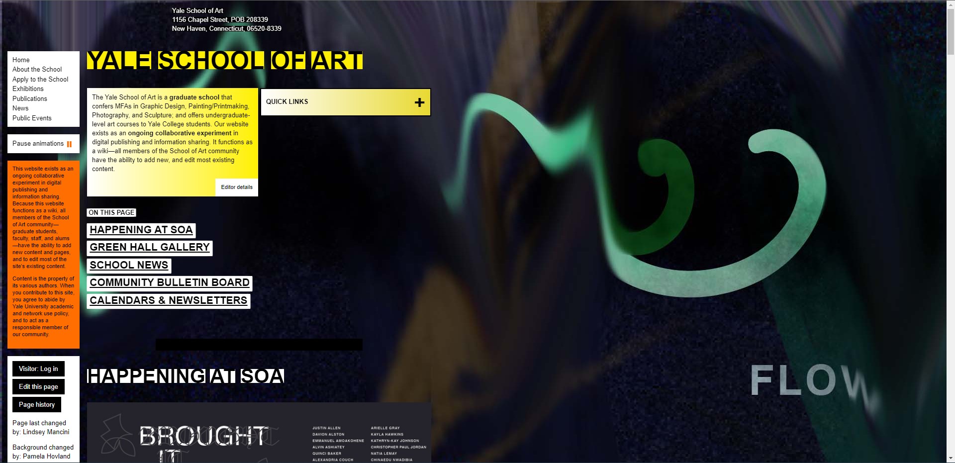
For one of the country’s top-ranked art schools, this web platform of the Yale School of Art is surprisingly lacking in aesthetic quality. Its homepage is overcome with clashing colors and illegible blocks of text. The background image is blurry, as though it were expanded beyond its aspect ratio. And beyond all of this, it has no organization. 6 Poor Websites and Why They’re Bad
The site elements appear scattered throughout its front page, and the user scrolls down to find digital flyers for various events with increasing polychromatic disorder. When you open the “quick links” tab on the left-hand side, the drop-down menu causes the text at the center of the page to jump down outside the screen – a confusing arrangement that makes it appear the relationship between elements was not taken into consideration at all.
And to make matters worse, YSOA violates the one cardinal rule of design in 2022 – mobile applicability. When visiting the mobile version, the already disordered elements become rearranged in such a way that they don’t even make sense – displaying the footer in the middle of the page for example, a clear sign that mobile was not taken into account when building the page.
To ameliorate these issues, the YSOA should try streamlining its design – going for essentials, simplifying their presentation, and again, striving for visual hierarchy.
#6: Broad Top Area Medical Center

This site’s homepage shares some of the same problems we’ve already discussed (overcrowded, lack of visual hierarchy), but is not necessarily the worst example of those things. One stand-out problem it does exhibit however, is its overstuffed navigation bar. 6 Poor Websites and Why They’re Bad
Nav bars should ideally have 5-6 tabs. This is the appropriate amount to be sufficient to display all the information the user needs, but not so much that it becomes overwhelming. 6 Poor Websites and Why They’re Bad
This site’s nav bar has nine tabs – so many that on some display screens, they don’t even fit. One has to scroll to the left to see the “News” tab, and on the right, the “Home” tab doesn’t appear at all.
This is another indication that the designers of this site did not account for different display screens, including mobile phones, tablets, or e-readers. Your audience is most likely not visiting your site from a desktop computer anymore, which means you have to follow suit.
Synthesizing all the aspects of good design and putting them into practice is tough. It’s even harder when you don’t have a qualified team of professionals on your side. To make sure you get the job done right, get the right people for the job. Visit 6Ninety9’s homepage to learn how to set up a consultation.
