Many businesses’ online presences rely heavily on the use of contact forms. It’s a great way to engage with users and to generate leads.
But bad contact forms can end up doing more harm than good. How can you avoid this problem and keep your forms doing what they’re intended to do, which is drive traffic and create conversions? That’s what we’re here to look at. Here are 6 ways to increase your contact form conversions today.
#1: Make sure your design is right
The main thing we mean when we talk about “bad” contact forms is poorly designed ones. Your contact form design should be simple, elegant, easy to read, contain all the necessary information, and only that information. Make sure this information is also arranged in a logical order, starting from the name (first, last), email, subject heading or title (if necessary), and a large field for the message. All fields should be labeled above and required fields should be denoted with a red star.
This format is familiar and classic, and therefore in addition to being comprehensive, it’s what the user’s brain gravitates to. If you start mixing up the order or introducing unfamiliar elements, it can be confusing. 6 Tips to Improve Your Contact Form Conversion Rate
#2: Use a limited number of fields

The fewer fields you include in your form, the higher the number of conversions you will enjoy. Studies show that forms containing three fields result in a 25% conversion rate, five fields a 20% conversion rate, and six or more fields a 15% conversion rate – showing a direct trend of an inverse relationship between the number of fields and the rate of conversions.
#3: Make your form a conversation
Creating a form conversation that guides your users through a short series of simple questions is an easy and accessible way to get your forms completed in a way that simultaneously increases engagement and improves UX. Questions appear one at a time on the page, reducing distractions and making the process less overwhelming. However if your form consists of only one or two questions, it might be best to make it an inline form. 6 Tips to Improve Your Contact Form Conversion Rate
#4: Get your placement right
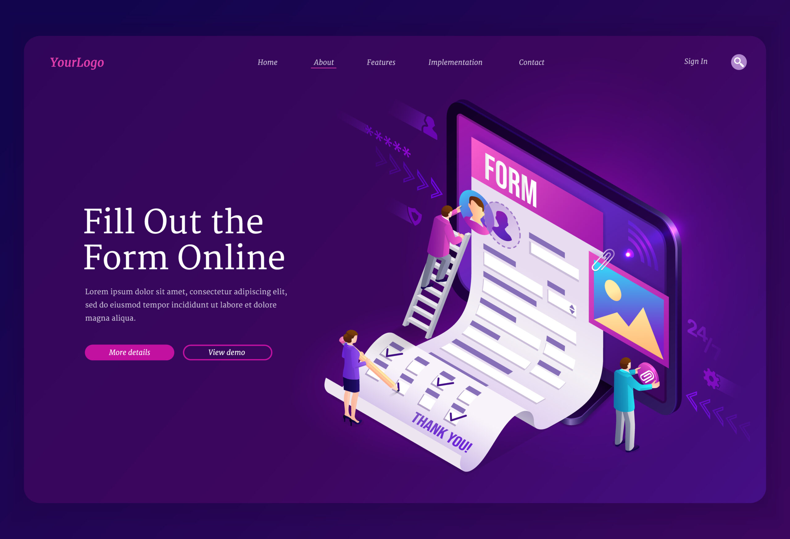
Situating your form in an optimal way on your website is key to its success. It should be featured not just on one page, but on multiple pages in multiple locations. Including a landing page with a simple form is a great way to put your form front and center and draw the user’s attention directly to it.
#5: Make sure it’s optimized for mobile
We’ve done a lot of study of how important it is to make sure your website is mobile-ready. Almost all of internet users worldwide – over 90% – use their phones, tablets, or other mobile devices to log in. So if your contact form isn’t accessible to mobile users, you’re shutting out almost all of the people you’re trying to reach. 6 Tips to Improve Your Contact Form Conversion Rate
This means making sure your text and design is visible, legible, and cleanly and logically presented on a mobile layout. This will also have the added benefit of forcing you to create simpler, more streamlined designs, due to the limited space.
#6: Have a prominent CTA button

What gets your visitors to complete the contact form is a compelling and visually attractive call-to-action (CTA) button. Buttons are the most common form of CTA, and they typically have an actionable phrase (“click here”/“submit form now”) and are presented in a bright or otherwise high-contrast color to distinguish themselves from the rest of the page, draw the user’s eye to the CTA and impel them to click.
By following this short starter list of contact form best practices, you’ll be well on your way to ramping up your traffic and conversions. Keep checking this page for more tips on how to take your online marketing game to the next level.

